Content Updates
Updated site content to feature latest projects and provide detailed project descriptions for users who desire to learn more.

Increased Readability
Restructured text for mobile readability, with larger font sizes and overlay boxes for additional information.

Enhanced Visuals
Introduced engaging visual elements, including work-in-progress photos, to showcase expertise and personalize the brand.


Improved Contact Options
Added alternative contact method for users without email setup, reducing frustration and abandonment.

Improved Navigation
Redesigned the navigation for desktop and mobile sites, enhancing findability and visibility.
Streamlining User Journeys with Stunning Visuals
THE SOLUTION
My Role: Product Designer l Client: Fashion & Interior Design Consultant l Project Status: Ongoing
Industry: Fashion & Interior Design Services
PROJECT OVERVIEW
About Sarah E. Atelier
-
New York City-based design studio known for its fashion and interior design services.
-
The company brings a unique blend of consultancy, creative direction, and both digital and manual embroidery.
-
The recent website redesign highlights its diverse capabilities and the growing demand for its services in the interior design field.
VALUE PROPOSITION
Designing for Business Evolution
-
Expanding into interior design while staying true to its fashion design roots.
-
Redesigned digital platform enriching the experience for new and existing clients prioritizing findability.
-
Maximizing the brand's incredible visual images to captivate visitors and highlight the brand's unique aesthetic.
PROJECT SCOPE
Deliverables
Research report
Style guide
Fully operational prototype
Launched site hosted on Wix


How might we redesign Sarah E. Atelier's website to effectively showcase its expansion into interior design while maintaining its strong fashion design identity?


My Role: Product Designer
Client: Fashion & Interior Design Consultant
Industry: Fashion & Interior Design Services
Project Status: Ongoing

Sarah E. Atelier's new site step-by-step ✨
PROTOTYPE WALKTHROUGH
So, how did I arrive to the end product?
Reflection
-
User feedback
-
Analytics setup
-
Next steps and suggestions


Delivery
-
Component library
-
Revisions
-
A/B testing
-
Wix publishing

Ideation
-
Sketching
-
Visual design
-
Wireframing
-
Prototyping

Synthesis
-
Improvement plan
-
Proto-Personas
-
Style options
-
Sitemaps

Discovery
-
Initial consultation
-
Business research
-
Heuristic evaluation
-
Usability testing
THE PROCESS
Strategically selecting methods aligned with goals and timeline
These site redesign methods were selected to deliver results swiftly and effectively leveraging a two-week timeline:
My toolbox
Design
Vector editing
Plan
Figma
Notion
Wix
Animations
JavaScript


Illustrator
Hosting platform
Discovery
Action: Added a "Behind the Scenes" section showcasing the process of creating intricate designs, highlighting Sarah's expertise and building trust with clients.
A Peek into the Design Process: Provide transparency and build trust by showcasing the design process.


Portfolio section of the Royal School of Needlework's website
Section of Sarah E. Atelier's About page
5. Product Focus
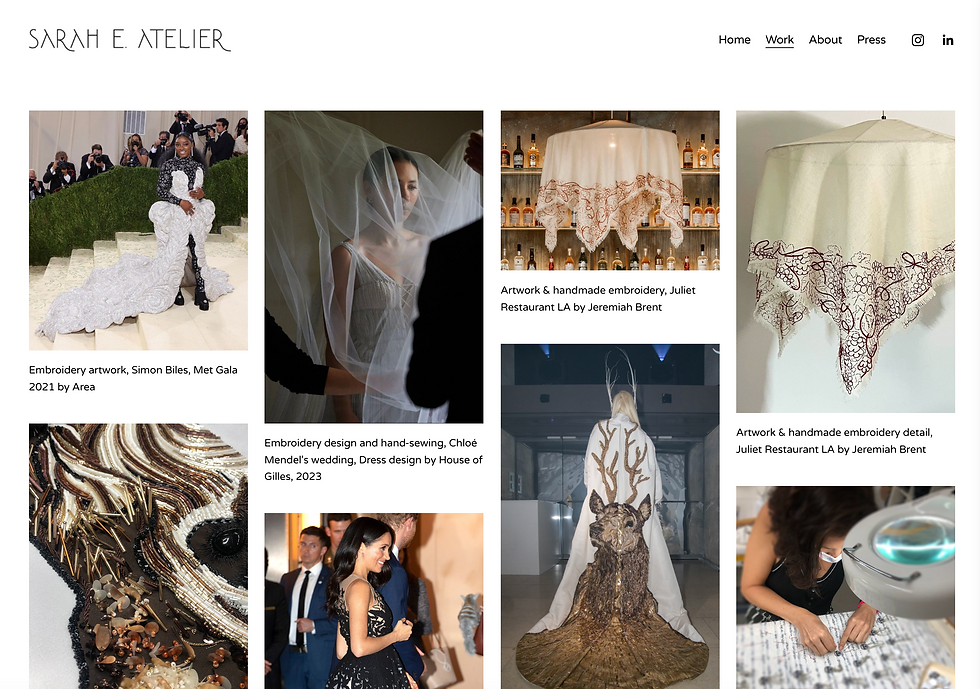
Action: Featured close-up images of Sarah E. Atelier's embroidery work to highlight expertise, later proving beneficial for client pitches to visualize techniques.
Detail Close-Up Pictures: High-resolution close-ups showcase the craftsmanship and intricate details of embroidery work.


Studio page of Atelier Lebuisson's website
Overlay in Sarah E. Atelier's Work page
3. Fonts
Action: Utilized sans-serif fonts (Montserrat and Inter) with a serif (Adamina) font for some details.
Sans-Serif: These fonts are modern, clean, and improve readability on screens.


Sustainibility page of Chanel's website
Section of Sarah E. Atelier's About page
1. Color Palettes
Action: Leverage black and white as the foundation, adding gray for a few elements, letting Sarah E. Atelier's beautiful high-resolution images take center stage.
Black & White: This classic color combination exudes elegance, sophistication, and a timeless feel – perfectly suited for a luxury brand.


Homepage of the Fédération de la Haute Couture et de la Mode website
Section of Sarah E. Atelier's Homepage
2. Imagery
Action: Ensured the website imagery adheres to these standards and maintains them throughout.
Straight-Edged & High-Resolution: Clean lines and high-quality images project professionalism and a focus on detail.

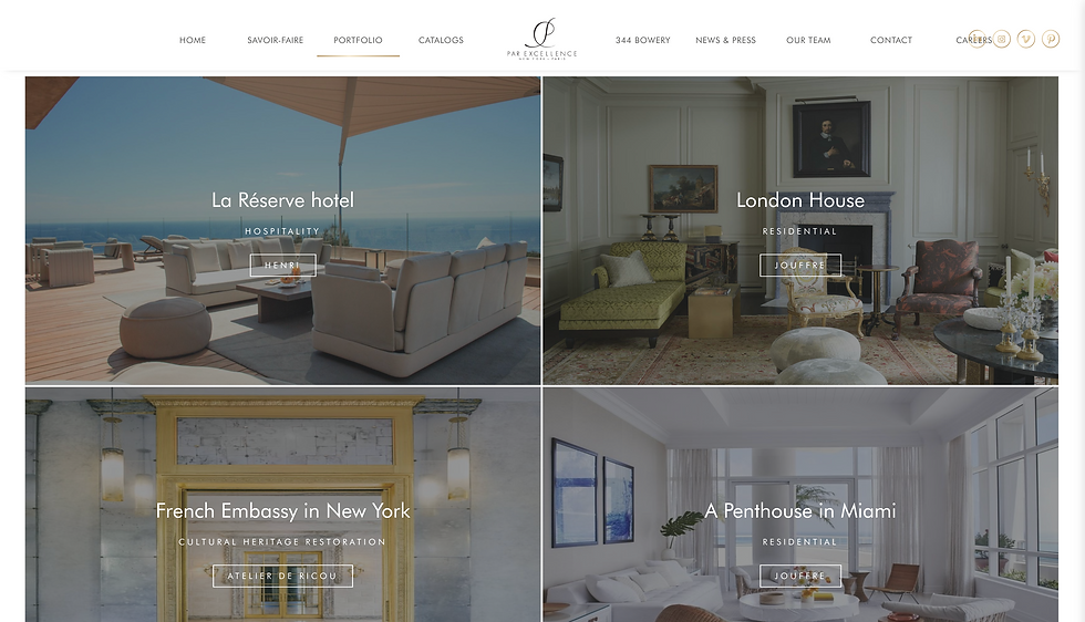
Portfolio page of Atelier Lebuisson's website
Section of Sarah E. Atelier's Work page
BUSINESS RESEARCH
Identifying standard practices and trends in the luxury space

Section of Sarah E. Atelier's Press page
4. Logos
Action: Highlighted existing logo and advised on adding a smaller square logo. Both logos, designed by the client, balance playfulness with the seriousness of the header and body fonts.
Simple & Elegant: Simpler logos are easier to remember and work well across various applications. Some playfulness is acceptable.

Homepage of Atelier Jolie's website
7. Highlighting Collaborations
Action: Showcased collaborations with renowned brands, demonstrating professionalism, craftsmanship, and versatility, fostering trust with potential clients.
Showcase collaborations: Build trust and establish credibility by showcasing expertise and industry relationships.


Collaborations page of Schiaparellis's website
Section of Sarah E. Atelier's Homepage
6. Process Images

With the goal of identifying and resolving usability roadblocks on the original website, I conducted a comprehensive heuristic evaluation. Each page was evaluated against 10 chosen heuristics, focusing on core principles of user experience design.
Identifying usability issues through best practices in UX
HEURISTIC EVALUATION


Score Chart
3
1 - 1.99
2 - 2.99
0 - 0.99
Major Problem
Medium Problem
Minor Problem
Meets Best Practice
Evaluation of the Original Site
Screenshot of the original site's heuristic evaluation
Make services more prominent and provide clearer service descriptions. Create a dedicated page for services.
❌ Hidden Services
Introduce a filtering system or search option.
The few interior design projects are hard to find.
Differentiate photos and links. Add hover information. Indicate external links.
Clicking images redirects to external websites without warning, and exiting the site is unclear.
Allow users to customize information using "learn more" options.
Users have limited control over the amount of showcased information.
Break text into smaller chunks and add supporting visuals.
About page's text without proper hierarchy is hard to digest.
Refine UI design to elevate the overall user experience.
Website design lacks a touch of luxury and modernity.
Increase body text size.
Text size is too small on desktop.
Update project showcases. Use higher-quality images.
Content is not up-to-date and some images are pixelated.
Findable
Services and their details are difficult to locate.
✅ Solution
Clear
❌ Hard-to-Find Interior Design Projects
✅ Solution
Findable
Useful
❌ External Link Issue
✅ Solution
Controllable
Communicative
❌ Limited Information Control
✅ Solution
Controllable
Useful
❌ Text-Heavy Sections with No Hierarchy
✅ Solution
Useful
Learnable
❌ UI Does Not Mirror Designs' Sophistication
✅ Solution
Delightful
❌ Small Desktop Text
✅ Solution
Accessible
❌ Outdated, Pixelated Content
✅ Solution
Credible
Valuable
Main Issues

Soon-to-be Bride
-
Requires guidance when collaborating
-
Has a less hands-on approach
-
Is a one-time collaborator
-
Seeks a customized and memorable experience
-
Values personalized, streamlined process

Brand's Creative Director
-
Expert in the subject
-
Has an established design identity and vision
-
Is a long-term collaborator
-
Seeks specific skill set
-
Values detailed project documentation
Tailoring the site to varied client needs
PROTO-PERSONAS
Due to time constraints, user interviews were not feasible. Proto-personas were developed based on discussions with the client to represent potential user archetypes.
Synthesis


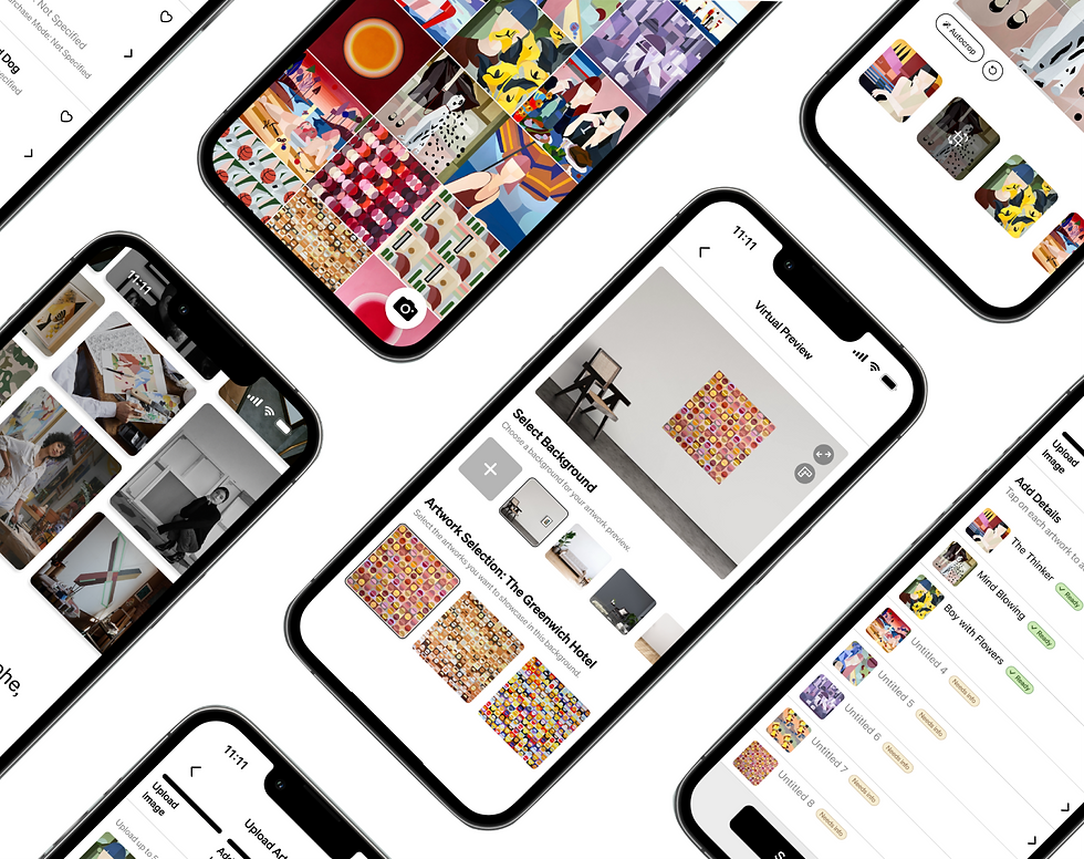
Due to time constraints, a mid-fidelity prototype wasn't feasible. Quick sketches were instrumental in early meetings with the client to efficiently communicate concepts and gather initial feedback, guiding the design direction.
Initial design sketches facilitated early feedback and design direction
LOW-FI SKETCHES
Ideation

Original Site
Final Version

Enhancing site performance through structural changes
SITEMAPS
Below is an overview of the architectural changes made to the sitemap, leading to enhanced site performance.

Key
As this sprint concludes, the ongoing collaboration with the client will benefit from a well-documented component library and style guide, ensuring future iterations are efficient and consistent. These tools will be instrumental in maintaining a cohesive user experience while streamlining the design process.
Ensuring consistency with a style guide and component library
STYLE GUIDE & COMPONENT LIBRARY

Delivery
Reflection
INITIAL CLIENT CONSULTATION
Establishing direction and vision
Defined Scope & Goals: Established project scope and goals for a responsive website redesign, including two revision cycles to meet client's timelines.

Selected Wix for Hosting: Opted for Wix to ensure easy future maintenance for the client.

Agreed on the Aesthetic Direction: Discussed preferences for sophistication and simplicity, including font choices inspired by the logo's aesthetic.

Organized Images: Organized high-res images into fashion, interior, bridal, and study categories for easy retrieval and to match client preferences during design.

Identified Competitors: Identified key competitors and comparators such as England Embroidery School and Atelier Lebuisson, setting the stage for a comprehensive competitive analysis later in the project.


(▲ +50%)
Direct Success Rate
Completion Time
User Rating
(▼ -1m 6.5s)
(▲ +2 stars)
To ensure the website caters to both industry professionals and those seeking professional guidance, I conducted usability testing with 6 participants. This group mirrored Sarah's clientele, ranging from designers with deep industry knowledge to clients who value her expertise but may not be fully versed in fashion and interior design.
Usability testing with industry experts and general users
USABILITY TESTING
Final Version Results
Find digital embroidery design support
Task 1
Learn about home decor projects and schedule a consultation
Task 2
Learn about Sarah's background
Task 3

Direct Success Rate
Completion Time
User Rating
(▲ +38%)
(▼ -1m 33s)
(▲ +2.25 stars)

Direct Success Rate
Completion Time
User Rating
(no change)
(▼ -11.75s)
(no change)
Changes


1
2
2
1
Hidden Service Details
Enhanced Service Visibility
1
Dropdown menus with hidden service details caused confusion for users.
1
A dedicated "Services" page was created to provide detailed information about the services offered.
2
In collaboration with the client, removed outdated services and streamlined the service list.
2
The redesigned website prioritizes service visibility eliminating the need for dropdown menus.
Original Site
Final Version

3
4
4
3
Unexpected Destinations and Lost Users
Clearer Paths to Desired Categories and Information
1
Users specifically looking for interior projects get lost as there are no filters or a search function.
3
A filtering system was implemented in the work section, featuring the business's main categories.
2
Clicking on images on the work page redirects users to external websites without warning.
4
Separated photos from external links, added optional additional information when hovering over images, and clearly indicated when clicking an image or link leads to an external website.


5
5
5
Limited Contact Options
Implemented Additional Contact Option
Clicking "Contact Here" opened an email pop-up, creating a barrier for users not logged into their email, leading to task abandonment by some participants.
5
Added a contact form directly on the website, offering an alternative to the email pop-up. The email option was retained for users who prefer it.
Original Site
Final Version
Original Site
Final Version
Project takeaways
LEARNINGS
Data-driven decisions enhance stakeholder meetings
Communicating with data during client and business advisor meetings helped me support design decisions with research and numbers, adding credibility and clarity to my process.
Early client checkins offer valuable business insights
Clients often have valuable insights that can greatly influence the design direction and decision-making process. Meeting early on was crucial for influencing my research process.
Investing in design systems can pay off in the long run
Despite the initial time investment in creating components and setting design rules, it ultimately saved a significant amount of time when making changes later on, especially given my tight timeline.


See more case studies
PlayPal Kids
Making financial literacy engaging through playful learning, fostering parent-child connections.
Concept Project
iPad & iPhone App


Cookie Jar
Website dedicated to assisting long-term, unmarried couples in achieving their shared financial aspirations.
Concept Project
Phone & Desktop Site

Coming Soon

Apostrophe Art
Empowering Artists by simplifying business tasks, enabling them to devote more time to their reative work.
Client Project
iPhone App

With the goal of identifying and resolving usability roadblocks on the original website, I conducted a comprehensive heuristic evaluation. Each page was evaluated against 10 chosen heuristics, focusing on core principles of user experience design.
Identifying usability issues through best practices in UX
HEURISTIC EVALUATION
Score Chart
3
1 - 1.99
2 - 2.99
0 - 0.99
Major Problem
Medium Problem
Minor Problem
Meets Best Practice
Evaluation of the Original Site
Screenshot of the original site's heuristic evaluation
Solution: Make services more prominent and provide clearer service descriptions. Create a dedicated page for services.
Problem: Services and their details are difficult to locate.
Findability & Clarity
Solution: Introduce a filtering system or search option.
Problem: The few interior design projects are hard to find.
Solution: Separate photos from external links. Add overlay boxes for more information when hovering. Indicate when clicking on images or links leads to external websites.
Problem: Clicking images redirects to external websites without warning, and exiting these pages is unclear.
Communicative & Controllable
Solution: Offer alternative contact methods (e.g., contact form). Allow users to tailor information or functionality to their needs (e.g., filtering system).
Problem: Contact option is inconvenient and limited user control over the amount of information showcased exists.
Controllable & Useful
Solution: Improve clarity and access to information about services. Break down text into smaller chunks and supplement them with visuals.
Problem: The path to get more information about services and the work showcased is confusing. Text-heavy sections are hard to digest.
Useful & Learnable
Solution: Refine UI design to elevate the overall user experience. Provide guidance for users through visuals and interactive elements.
Problem: Website design lacks a touch of luxury and modernity, and limited guidance is offered for users to learn more and contact the business.
Delightful
Solution: Increase body text size.
Problem: Text size is too small on desktop.
Accessibility
Solution: Update project showcases and content regularly. Use higher-quality images throughout the website.
Problem: Content is not up-to-date and some images are pixelated.
Credibility & Valuable
What comes next?
NEXT STEPS
-
Card Sorting for Category Testing: Due to time constraints, we couldn't conduct card sorting, particularly for the "studies" category, in this sprint. Card sorting could potentially help refine the category structure and improve user navigation.
-
Service Review and Update: As more interior projects are added, updating the services section will ensure the website reflects Sarah E. Atelier's current offerings and expertise.
-
Primary Navigation Optimization: To improve user experience, optimize the primary navigation by moving the "Press" section under "About" and testing its performance. This can streamline navigation and make key information more accessible.
Feel free to reach out!
Designed and coded with ♥ between 2023-2024.
Hidden Services
Services and their details are difficult to locate.
Solution
Clear
Findable
Hard-to-Find Interior Design Projects
The few interior design projects are hard to find.
Solution
Useful
Findable
Make services more prominent and provide clearer service descriptions. Create a dedicated page for services.
Introduce a filtering system or search option.
With the goal of identifying and resolving usability roadblocks on the original website, I conducted a comprehensive heuristic evaluation. Each page was evaluated against 10 chosen heuristics, focusing on core principles of user experience design.
Identifying usability issues through best practices in UX
HEURISTIC EVALUATION
Score Chart
3
1 - 1.99
2 - 2.99
0 - 0.99
Major Problem
Medium Problem
Minor Problem
Meets Best Practice
Evaluation of the Original Site
Screenshot of the original site's heuristic evaluation
Main Issues
